
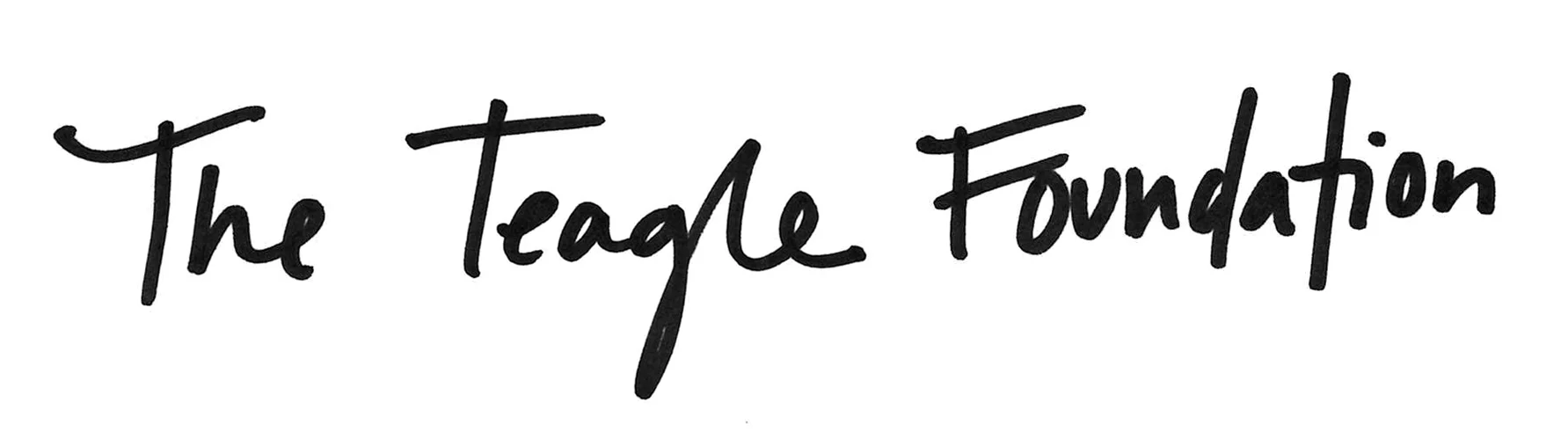
Typographic Juxtoposition defines liberal arts.
At C&G Partners, I worked with The Teagle Foundation on a brand redesign. The goal of the rebrand was to accurately convey the organization’s mission of advancing liberal arts education and promote the value of collaboration with their grantees.
The identity system needed to be understated enough to not take away from the substance of the work they are doing, yet distinctive enough to be recognizable and to empower the future of the field of liberal arts education.

Image Courtesy of C&G Partners
The Teagle Foundation’s previous logo was a tree of knowledge, and the new brand identity needed to continue to support the idea of knowledge, in a less literal sense. It was also important to brand around the strength and legacy of the Teagle name.
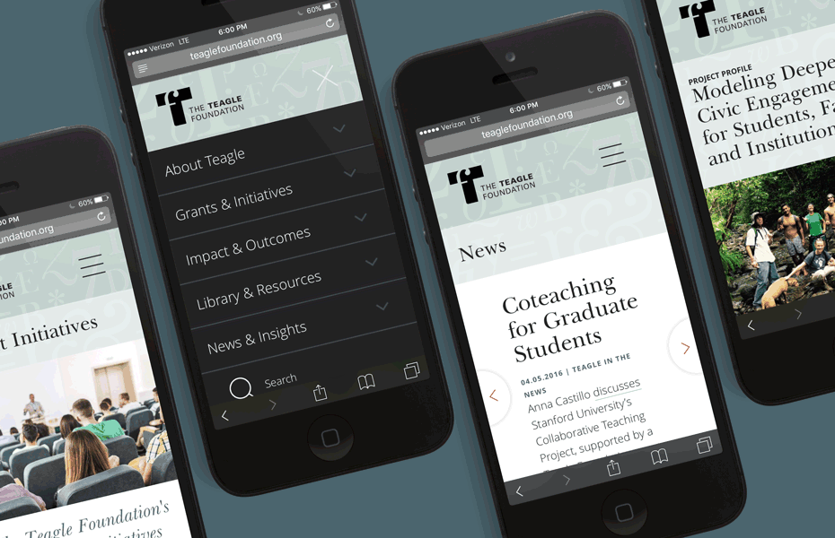
Image Courtesy of C&G Partners
The resulting logo is a strong, sans-serif capital ‘T’ with a delicate lowercase serif ‘f’ knocked out of it, locked up with the organization name. This mark visualizes the concept of bridging traditional academic value system with the future-forward problem solving for the liberal arts that the Teagle Foundation facilitates.

Image Courtesy of C&G Partners
To accompany the logo mark lockup, we developed a set of serene patterns made from the building block of the liberal arts field: language. We used letters, numerals, and symbols to signify all areas of Liberal Arts.